
Post
Bedroom Color Psychology: Choosing the Right Color to Complement Your Bed
Jun
Bedroom Color Psychology: Choosing the Right Color to Complement Your Bed
Color is one of the most powerful tools available to anyone designing a bedroom, yet it is also one of the most frequently underestimated. The colors that surround your bed as you sleep and wake profoundly influence your mood, your ability to relax, your sleep quality, and even your energy levels throughout the following day. Color psychology, the study of how colors affect human behavior and emotion, offers a rich body of evidence-based guidance for choosing bedroom colors that support the rest and restoration that a bedroom should provide. Whether you are selecting a paint color for the walls, choosing bedding in a particular hue, or deciding on the finish of a new bed frame, understanding the psychological impact of color will help you make choices that serve your wellbeing as well as your aesthetic preferences.
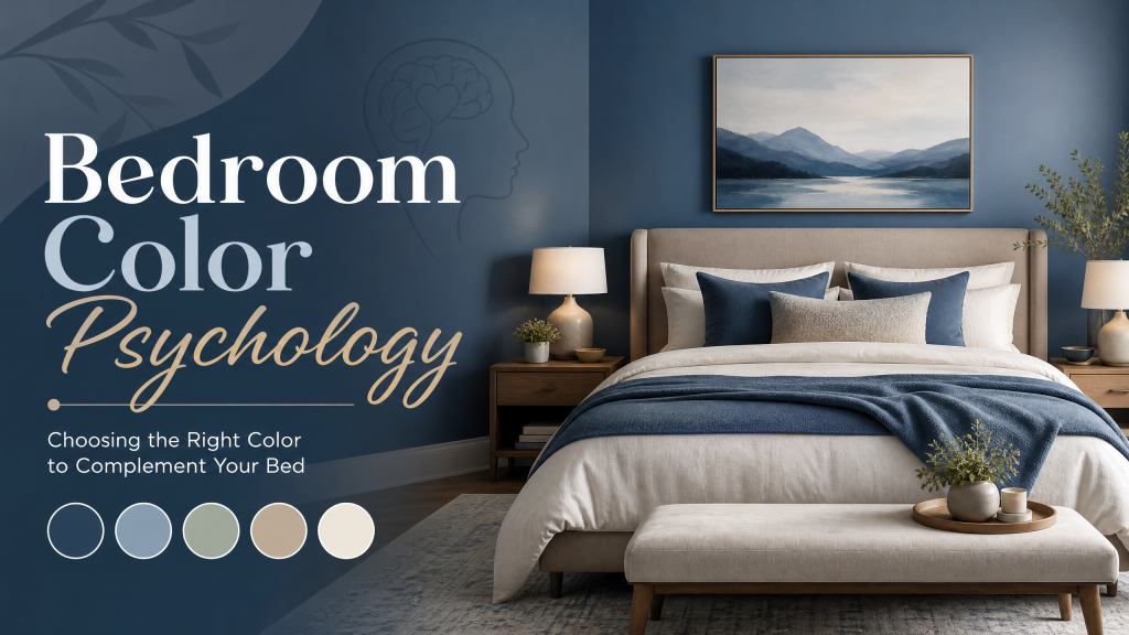
The Psychology of Blue in the Bedroom
Blue is consistently ranked as the most sleep-promoting bedroom color in scientific studies, and the reasons are both physiological and psychological. Blue is associated with calm, serenity, trust, and stability, and studies have shown that people in blue bedrooms tend to get more sleep and rate the quality of their sleep more highly than those in bedrooms decorated in most other colors. Lighter shades of blue such as powder blue, sky blue, and pale aquamarine are particularly effective for creating a peaceful, airy atmosphere that promotes relaxation. Deeper shades of blue such as navy and midnight create a more cocooning, intimate atmosphere that many find deeply conducive to rest. Blue coordinates beautifully with bed frames in white, natural wood, and brass finishes, making it an extremely versatile choice for the bedroom.
The Calming Power of Green
Green, as the color most associated with nature, growth, and renewal, is another excellent choice for the bedroom environment. The human eye is more sensitive to the wavelengths of light associated with green than to those of almost any other color, which is believed to make green inherently restful to look at. Soft, muted shades of green such as sage, eucalyptus, and olive create a soothing, nature-connected atmosphere that feels simultaneously fresh and deeply calming. Deep, rich greens like forest green and hunter green add a sense of lushness and sophistication. Green coordinates naturally with wooden bed frames and complements warm-toned accent colors such as terracotta, cream, and soft gold exceptionally well.
Warm Neutrals: The Timeless Safe Bet
Warm neutral colors including cream, ivory, warm white, greige, and soft taupe remain among the most popular choices for bedrooms across every design style, and their enduring appeal is well-founded. These colors create a sense of warmth and comfort without being overstimulating, provide the perfect neutral backdrop against which the bed and other furniture can take center stage, and work harmoniously with virtually any bedding color or pattern. Warm neutrals are particularly effective in bedrooms that receive limited natural light, as their warmth counteracts the cool, flat effect that north-facing light can create with cooler neutrals and whites. They also coordinate with every possible bed frame finish, from natural wood to white painted wood to black metal to upholstered fabric.
The Risks of Red and Other Energizing Colors
While red, orange, and bright yellow are powerful and exciting colors that have their place in interior design, they are generally not recommended as dominant colors in bedrooms intended primarily for rest and sleep. These warm, high-saturation colors are physiologically activating, increasing heart rate and stimulating the nervous system in ways that are counterproductive to the relaxation needed for sleep. If you are drawn to these energizing colors and want to incorporate them in your bedroom, do so through small accent pieces such as throw pillows, artwork, or a single painted accent wall, rather than as dominant colors on all four walls. A bedroom with predominantly neutral or cool calming tones punctuated by carefully chosen warm accents can achieve a beautiful, vibrant aesthetic without sacrificing the restful atmosphere the room needs.
Matching Wall Colors to Your Bed Frame
The relationship between your wall color and your bed frame finish is one of the most important design decisions in the bedroom. Dark wall colors in charcoal, navy, or deep green create a dramatic, sophisticated backdrop that makes a light-colored or metallic bed frame stand out in sharp relief. Light wall colors in white, cream, or pale blue make dark wood or black metal frames look bold and intentional. Medium-toned walls in sage, warm grey, or dusty rose create a softer, more harmonious composition with bed frames in complementary tones. When in doubt, consider the 60-30-10 rule of interior design: allow the dominant wall color to occupy approximately 60 percent of the room’s visual space, the bed and major furniture pieces to occupy roughly 30 percent, and accent colors in pillows, throws, and artwork to occupy the remaining 10 percent.
Using Color to Influence Perceived Room Size
Color can also be used strategically to influence the perceived size and proportions of a bedroom. Lighter wall colors in cool whites, pale blues, and light greys make a room feel more spacious and airy by reflecting more light and visually receding. Darker, more saturated wall colors absorb light and advance visually, making a room feel smaller and more intimate. In a small bedroom where space is at a premium, choosing lighter wall tones and a bed with a slim, low-profile frame will maximize the sense of spaciousness. In a very large bedroom that feels impersonal or cold, darker, richer wall tones combined with a substantial, visually grounding bed can create a more cozy and intimate atmosphere.
Conclusion
The colors you choose for your bedroom environment have a genuine and measurable impact on your sleep quality and daily wellbeing. By applying the principles of color psychology and understanding how different hues interact with your bed frame and other bedroom furnishings, you can create a bedroom that is not only visually beautiful but also deeply supportive of rest and restoration. Explore our collection of bed frames in every finish and material to find the perfect anchor for your ideal bedroom color scheme.